• Thanks for stopping by. Logging in to a registered account will remove all generic ads. Please reach out with any questions or concerns.

U.S. 2012 Election

On Nov 6 Who Will Win President Obama or Mitt Romney ?

  • President Obama

    Votes: 39 61.9%
  • Mitt Romney

    Votes: 24 38.1%

  • Total voters
    63
  • Poll closed .
It's not their "info" that needs to be questioned, it's their method of delivery. Clearly, the way the statistics are presented on this graph is to manipulate the person interpreting into thinking it means something it doesn't (in other words, that the true unemployment rate is 36.3%).

It's biased presentations of data like this that lead to people dismissing any statistic as "lies, damn lies, and statistics," and makes it that much harder for all of us.

EDIT: Just for the record, I'm still waiting to see Thucyclides answer, if he actually believes that, before I actually point out one (of many) huge gaping hole in this stupid graph.
 
ballz said:
It's not their "info" that needs to be questioned, it's their method of delivery. Clearly, the way the statistics are presented on this graph is to manipulate the person interpreting into thinking it means something it doesn't (in other words, that the true unemployment rate is 36.3%).

It's biased presentations of data like this that lead to people dismissing any statistic as "lies, damn lies, and statistics," and makes it that much harder for all of us.

EDIT: Just for the record, I'm still waiting to see Thucyclides answer, if he actually believes that, before I actually point out one (of many) huge gaping hole in this stupid graph.

I wouldn't hold your breath. Thucyclides doesn't actually engage in debate. He throws out stuff like this and thinks it ends debate, unfortunately.

You're right about how these sorts of presentations influence things. But that's the modus operandi - shift the debate from issues to nonsense. It's nothing new at all.
 
The huge gaping hole is in the percentage of the work force actively working or seeking work.  I haven't read any refutations of that, yet.
 
It looks like they perhaps have to get those freeloading kids and seniors pulling their weight by getting jobs then ;D
 
As long as the criteria for selecting who is in the work force haven't changed, the comparison of percentages from year to year is valid.
 
Brad Sallows said:
As long as the criteria for selecting who is in the work force haven't changed, the comparison of percentages from year to year is valid.

Somewhat. That graph has zoomed in on the Y-axis (not the first time Thucyclides has posted a graph that's zoomed in on one axis, which serves to dramatize the up's and down's). The comparison from year to year isn't dramatic at all. From the time of the stimulus, the percentage has changed by *at most* 2%.

Why has it changed by 2%? I don't know. Some of it may be unemployment, some of it may be more people going on welfare... Some of it may also be from the trend that happened in 2008 of more people deciding during the recession to go back to post-secondary schools, or stay in post-secondary schools for longer (to get their Master's instead of trying to get a job with Bachelor's and no experience), etc.

*One* (there are more, this is just an obvious one that stuck out to me) of the huge gaping holes in that 36.3% (I'll say it since Thucyclides has no interest in answering the mail on this graph) is students, who don't count as "participating in the labour force" and they aren't considered unemployed. I don't know how many people in the US are students, but some of the info I have found is that 36.1% of 20-24 year olds in the US are taking post-secondary schooling. There are around 20 million Americans in that age group, so that's around 7.22 million 20-24 year olds that this statement

"To put it another way, 36.3% of working-age Americans do not have a job and are not even looking."

suggests are part of the true unemployment rate.


So forgive me for hesitating to believe partisan statistics and graphs. ::)

EDIT: To add sources

36.1% comes from here http://www.cli-ica.ca/en/about/about-cli/indicators/know-pse.aspx
~20 million 20-24 year olds came from Wiki http://en.wikipedia.org/wiki/Demographics_of_the_United_States
 
If anyone is interested in looking at unbiased numbers to inform themselves, personally I'd look at the U6 unemployment rate. To me, it's as close to the "true" unemployment rate as I've been able to find.

http://portalseven.com/employment/unemployment_rate_u6.jsp

I don't have any dog in this fight, but that graph would suggest that things are slowly improving since the huge spike during the 2008 recession.
 
ballz said:
Please tell me you don't believe that the "true unemployment rate" is 36.3% like this graph is suggesting?

No, that is the percentage of Americans of working age who are not looking for work. The unemployment rate (looking for work and unemployed but no longer working) is known as U3 and is a bit over 11%. Only by subtracting the unemployed who are no longer looking fo we get the 8.3% rate being publicly presented as the unemployment rate.
 
Thucydides said:
No, that is the percentage of Americans of working age who are not looking for work. The unemployment rate (looking for work and unemployed but no longer working) is known as U3 and is a bit over 11%. Only by subtracting the unemployed who are no longer looking fo we get the 8.3% rate being publicly presented as the unemployment rate.

Which consistently uses the same metric in order to allow for comparisons.  :facepalm:
 
"Zooming in" is reasonable.  For that number, a one percentage point change represents a dramatic swing.  It's not as if the graph becomes more meaningful if you display it from 0 to 100.  Some number well above zero would represent a catastrophic threshold.

The  misleading par is the y-axis: "Percentage of Americans in the labour force".  That percentage is bound to change due to demographic shifts.  For example, the percentage of Americans in the labour force should have been highest during periods of low unemployment while the boomers were in their prime.  It needs to be something like "percentage of Americans in peak working years (say, 20-65) in the labour force".
 
The Partisan and Biased CBO comes up with similar figures:

http://news.investors.com/articleprint/601660/201202171842/obama-jobless-rate-threatens-re-election.aspx

High Real Unemployment Data Reflect Poorly On Obama

Posted 02/17/2012 06:42 PM ET

Economy: The media machine that desperately wants Barack Obama re-elected has turned its focus on what it says are good unemployment numbers. The truth, though, is the job climate in America is miserable.

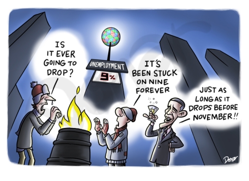
While the media and the administration portray the most recent jobs number — 8.3% unemployment — as good economic news, more sober minds understand what's really going on. The facts show a jobs slump that should not get an incumbent president re-elected.

Sure, the jobless rate is falling. But according to the Congressional Budget Office, we are going through the longest stretch of high unemployment since the Depression. The rate has been higher than 8% since February 2009, the month after Obama took office.

And, says the CBO, it is expected to stay above 8% through 2014.

Even worse for an administration straining to make the case that it deserves to be around for another four years is the real unemployment rate. It's not 8.3%, but closer to 15%, a figure that reflects those who "would like to work but have not searched for a job in the past four weeks as well as those who are working part time but would prefer full-time work," says the CBO.

Another White House problem comes from this in the CBO report: "The share of unemployed people looking for work for more than six months — referred to as the long-term unemployed — topped 40% in December 2009 for the first time since 1948, when such data began to be collected; it has remained above that level ever since."


The CBO data aren't isolated. Gallup reports that its unemployment rate based on weekly surveys stands at 9%, while underemployment is at a hefty 19%.

Also threatening Obama's re-election offensive is the nation's shrinking labor force (see chart). Many laid-off workers, frustrated by grim prospects, have stopped looking for jobs and are no longer in the labor pool.

That makes the jobless rate look better, as that number is a percentage of the labor force, not the overall national population. But those jobless Americans are real people who will cast real votes in November.

The trouble is fixing these facts in voters' minds. They need to know the full truth, not the half-truth the media and the White House feed them.
 
Thucydides said:
No, that is the percentage of Americans of working age who are not looking for work. The unemployment rate (looking for work and unemployed but no longer working) is known as U3 and is a bit over 11%. Only by subtracting the unemployed who are no longer looking fo we get the 8.3% rate being publicly presented as the unemployment rate.

The 8.3% is the U3 rate.

The U3 unemployment rate is the "official" unemployment rate that gets shown all the time. I think you're trying to say the U4 rate (U3 plus those who've given up looking) is 11% (it's 9.9 according to what I'm looking at). http://www.deptofnumbers.com/unemployment/alt-measures/

Like I said, in my opinion the U6 is the closest to "true." No matter what rate you choose, the trend in the unemployment rate is that it's decreasing.

So what was the point in posting that horrendously partisan graph about how "grim" everything is if... you know what, nevermind...

EDIT:

Thucydides said:
The Partisan and Biased

Please... you're killing me.
 
For the moment, at least, everything is coming up roses for President Obama:

1. The economy, by most measures, is somewhat better ~ maybe there's "light at the end of the tunnel" or something like that, in any event Americans are starting to breathe a little easier, for now, anyway; and

2. The Republican contenders look like clowns.

If the election was on 6 March 2012 it would look like Obama in a walk ... but it's on 6 November 2012 and a lot can happen between now and then.
 
E.R. Campbell said:
For the moment, at least, everything is coming up roses for President Obama:

1. The economy, by most measures, is somewhat better ~ maybe there's "light at the end of the tunnel" or something like that, in any event Americans are starting to breathe a little easier, for now, anyway; and

2. The Republican contenders look like clowns.

If the election was on 6 March 2012 it would look like Obama in a walk ... but it's on 6 November 2012 and a lot can happen between now and then.

When we're talking about the same country that re-elected Bush, nothing, no matter how far fetched, illogical or just plain ridiculous is out of the question.
Maybe someone here sees a competent leader who can manage the mess they are in.  Not sure that I do.  Not expecting them to find a guy who can get them out of the hole they've dug, just hopeful that they can find someone who'll get everyone to agree to quit digging. 
As long as partisan politics are ruling the day, the US will continue to be a mess.  The big hope with Obama was and end to exactly that.  :2c:
 
E.R. Campbell said:
For the moment, at least, everything is coming up roses for President Obama:

1. The economy, by most measures, is somewhat better ~ maybe there's "light at the end of the tunnel" or something like that, in any event Americans are starting to breathe a little easier, for now, anyway; and

2. The Republican contenders look like clowns.

If the election was on 6 March 2012 it would look like Obama in a walk ... but it's on 6 November 2012 and a lot can happen between now and then.

A lot of numbers are looking good but it's merely the start of a very long road to climb out of. But the fact that the Republicans are seeming to fall over each other to look more nuts, and the ongoing dramatics are likely to be strongly in the favour of Democrats, because it'll push a lot of independents into their arms out of disgust with the ongoing nonsense about contraception - and frankly, that gets more and more ridiculous by the day. You would think that if the GOP wanted to be serious contenders in November they'd be looking to court those moderates, not alienate them. I don't get what their "strategy" is at all.
 
The U-6 rate is questionable as well. I was listening to a discussion about which numbers more accurately depict the situation. One thing that one of the interviewees pointed out is that the higher numbers take in not only people filing unemployment claims but actively seeking work, it also includes aspects which really shouldn't be included, such as people in prison, people who have returned to school, people with disabilities who cannot work, and surprisingly, active duty military personnel.

But they also pointed out that no matter what number you use, increases or decreases in the actual numbers are real, and follow the same overall trending. So a drop in the U-3 rate will be reflected similarly in any other metric you choose (unless you deliberately choose a metric designed to not follow that trend).
 
cupper said:
The U-6 rate is questionable as well. I was listening to a discussion about which numbers more accurately depict the situation. One thing that one of the interviewees pointed out is that the higher numbers take in not only people filing unemployment claims but actively seeking work, it also includes aspects which really shouldn't be included, such as people in prison, people who have returned to school, people with disabilities who cannot work, and surprisingly, active duty military personnel.

My understanding of the U6 rate is that it does not include people in prison, people who have returned to school, people with disabilities, or active duty personnel because those people are not considered to be part of the labour force. They are part of that 36.3% in the graph Thucyclides posted, however.

From the link I posted earlier
Below is the overview of these six measures.

U1:
This is the proportion of the civilian labor force that has been unemployed for 15 weeks or longer. This unemployment rate measures workers who are chronically unemployed. During business-cycle expansions, this rate captures structural unemployment. However, during lengthy business-cycle contractions, this rate is also likely to include a significant amount of cyclical unemployment. U1 tends to be relatively small, in the range of 1-2 percent.

U2:
This is the proportion of the civilian labor force that is classified as job losers (workers who have been involuntarily fired or laid off from their jobs) and people who have completed temporary jobs. During business-cycle expansions, this rate is likely to capture some degree of frictional unemployment. However, during business-cycle contractions, this rate is most likely to consist of cyclical unemployment. U2 is larger than U1, but still remains substantially less than the official unemployment rate (U3).

U3:
This is the official unemployment rate, which is the proportion of the civilian labor force that is unemployed but actively seeking employment.

U4:
This is the official unemployment rate that is adjusted for discouraged workers. In other words, discouraged workers are treated just like other workers who are officially classified as unemployed, being included in both the ranks of the unemployed and the labor force. It is technically specified as the proportion of the civilian labor force (plus discouraged workers) that is either unemployed but actively seeking employment or discouraged workers. The addition of discouraged workers generally adds a few tenths of a percentage point to the official unemployment rate.

U5:
This augments U4 by including marginally-attached workers to the unemployment rate calculation. Marginally attached workers are potential workers who have given up seeking employment for various reasons. One of these reasons is that the workers believe such effort would be futile, which places them in the discouraged worker category. Those who have other reasons for not seeking employment are placed in the broader marginally-attached workers category. The addition of marginally-attached workers adds a few more tenths of a percentage point to the official unemployment rate.

U6:
This augments U5 by including part-time workers to the unemployment rate calculation. The addition of part-time workers adds a full 2-3 percentage points to the official unemployment rate. This measure of unemployment is perhaps the most comprehensive measure of labor resource unemployment available.

One thing that is worth doing is comparing the U1 to the others. This tells you what percentage of people from whatever rate you choose to use have been unemployed longer than 15 weeks. So an example would be if the U3 is 8.3 and the U1 is 4.3, then 4% of the unemployed have been unemployed for longer than 15 weeks.
 
2012newyears.jpg


Back
Top